
CHOOSING THE PERFECT WHITE PAINT
A BEGINNER’S GUIDE
If you’ve ever stood in front of a wall of white paint chips wondering how they can all be so different, you’re not alone. Choosing the right white or off-white paint may seem simple, but it’s one of the trickiest (and most impactful) choices you can make in a space.
As designers, we get asked all the time: Which white is the right white? The answer? It depends. Here's why — white isn’t just white! Paint colours, especially whites, are highly sensitive and reactive due to the constant reflecting and refracting of the light and colours in the space around it. This means that the perceived colour of white paint can shift noticeably depending on factors:
LIGHTING
The amount of natural lighting versus artificial lighting, as well as, the temperature of your lighting, whether warm or cool, can make a white paint appear to have different undertones. For example, a white with a slight blue undertone might appear more blue under cool LED lighting and more gray under warm incandescent lighting.
PAINT PROPERTIES
Even within the realm of white paints, there's a spectrum of colours. Some whites are naturally cooler, with a hint of blue or green, while others are warmer, with a hint of yellow or gray. These subtle differences become more apparent when comparing different white paints side-by-side or when looking at a white wall against another white.
LIGHT REFLECTION
White paint is designed to reflect a high percentage of light, making it a popular choice for creating brighter spaces. However, this very property also means that white is highly susceptible to absorbing any other colours in the surrounding environment and reflecting them back. The other colours of your finishes, materials, furniture, adjacent spaces, and even what’s outside your window will also influence how white paint appears. A white wall with a red rug will appear more pink, while a white wall with a blue rug might appear more blue.
We’ve seen it all: a crisp white space reading too warm because of sunlight bouncing off the neighbour’s yellow exterior, and a perfectly neutral wall go green thanks to reflections from a backyard pool and leafy trees. It’s not just colour—it’s colour chemistry. That’s why testing paint in the actual space is a must. Move it around the room, check it in morning and evening light, and hold it next to any dominant tones in your finishes and furnishings. Often people assume paint is the starting point, however we almost always select it last! With endless paint options available, especially whites, it’s much easier to choose a white that complements your finishes, materials, and furniture after those key elements are in place. This ensures the undertones work harmoniously and nothing feels off once the space comes together.
So, if you’re dipping your toes into a DIY reno or thinking of freshening up a room, here are some of our most loved options to start testing — and keep in mind that this is simply a jumping off point to start exploring the options that best suites your space!
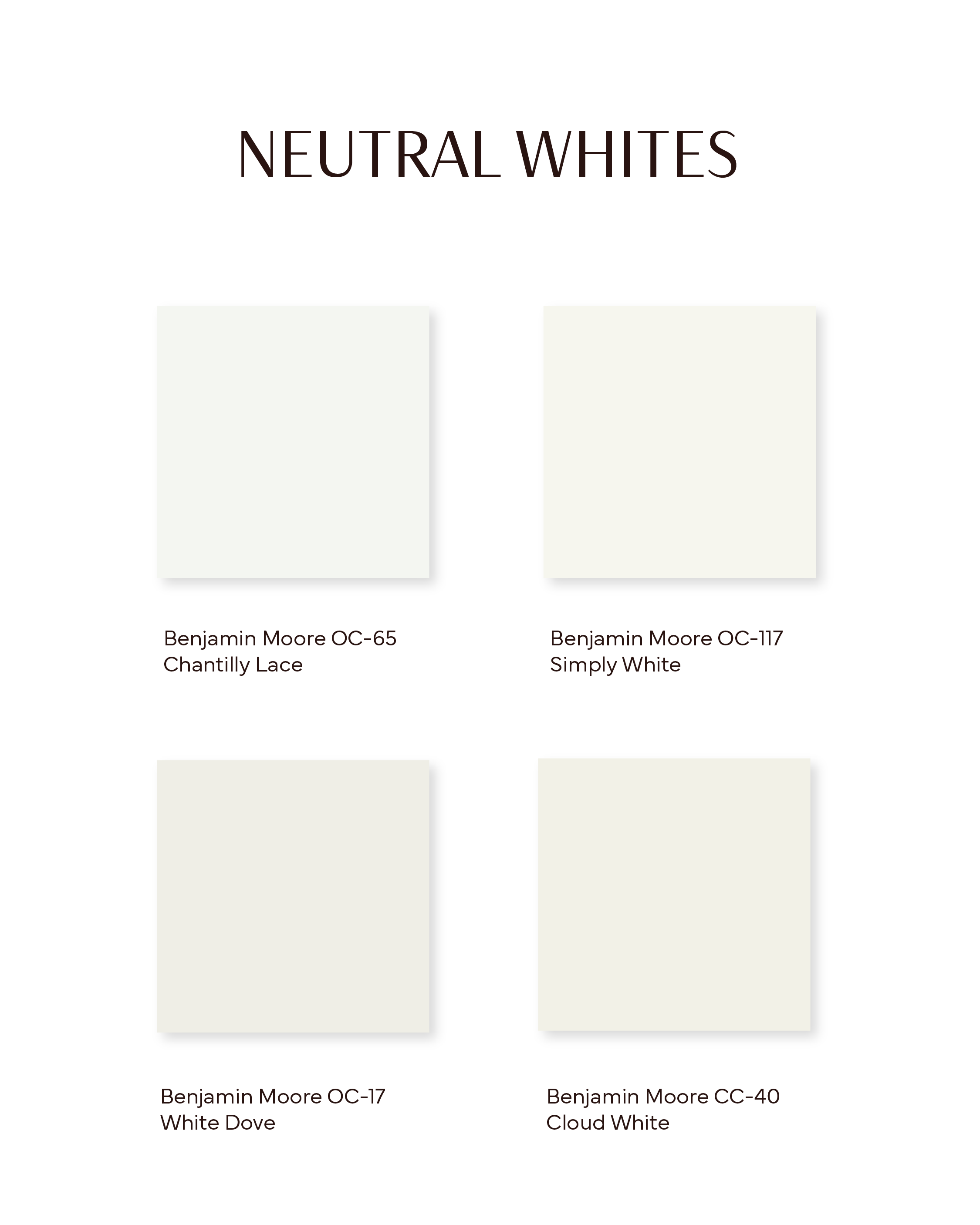
NEUTRAL WHITES
Benjamin Moore OC-65 - Chantilly Lace
A classic, neutral bright and silky white that elicits a feel of fresh cotton.
Benjamin Moore OC-117 - Simply White
A long-time fave, this simple, creamy yet crisp white has just the right touch of warmth (warmer than Oxford White/Cloud White, but not as warm as Swiss Coffee/Heron Plume), so it's a nice midpoint between those.
Benjamin Moore OC-17 - White Dove
A classic for good reason — creamy, cozy, and timeless.
Benjamin Moore CC-40 - Cloud White
Creamy, soft, neutral, and bright! This versatile and balanced white is one of our most used, including our Design Shop office/Deb’s home!

Design Shop Office in Benjamin Moore CC-40 - Cloud White
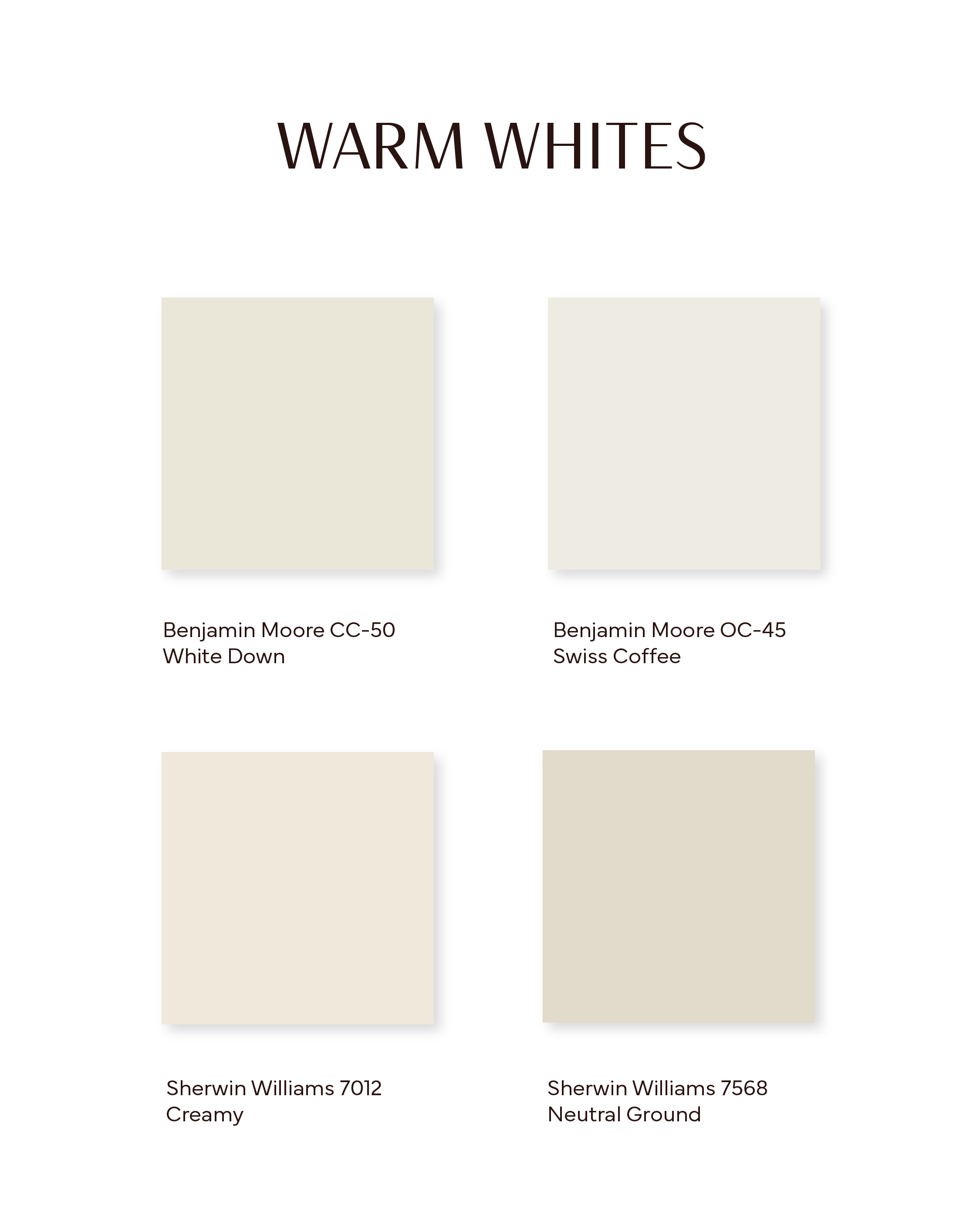
WARM WHITES
Benjamin Moore CC-50 - White Down
A versatile white with a subtle, taupey undertone that allows it to pair beautifully with both warm wood tones and slightly cooler palettes.
Benjamin Moore OC-45 - Swiss Coffee
Fairly neutral, but definitely veering warmer off-white. Not overpoweringly warm, and the undertones are de-saturated so it doesn't read too strongly as yellow unless a lot of other finishes in the space are very yellow-y/warm themselves.
Sherwin Williams 7012 - Creamy
A bright white with the softest of yellow undertones to create a subtle warmth in the room.
Sherwin Williams 7568 - Neutral Ground
A cozy, warm off-white with khaki undertones and a homey feel.
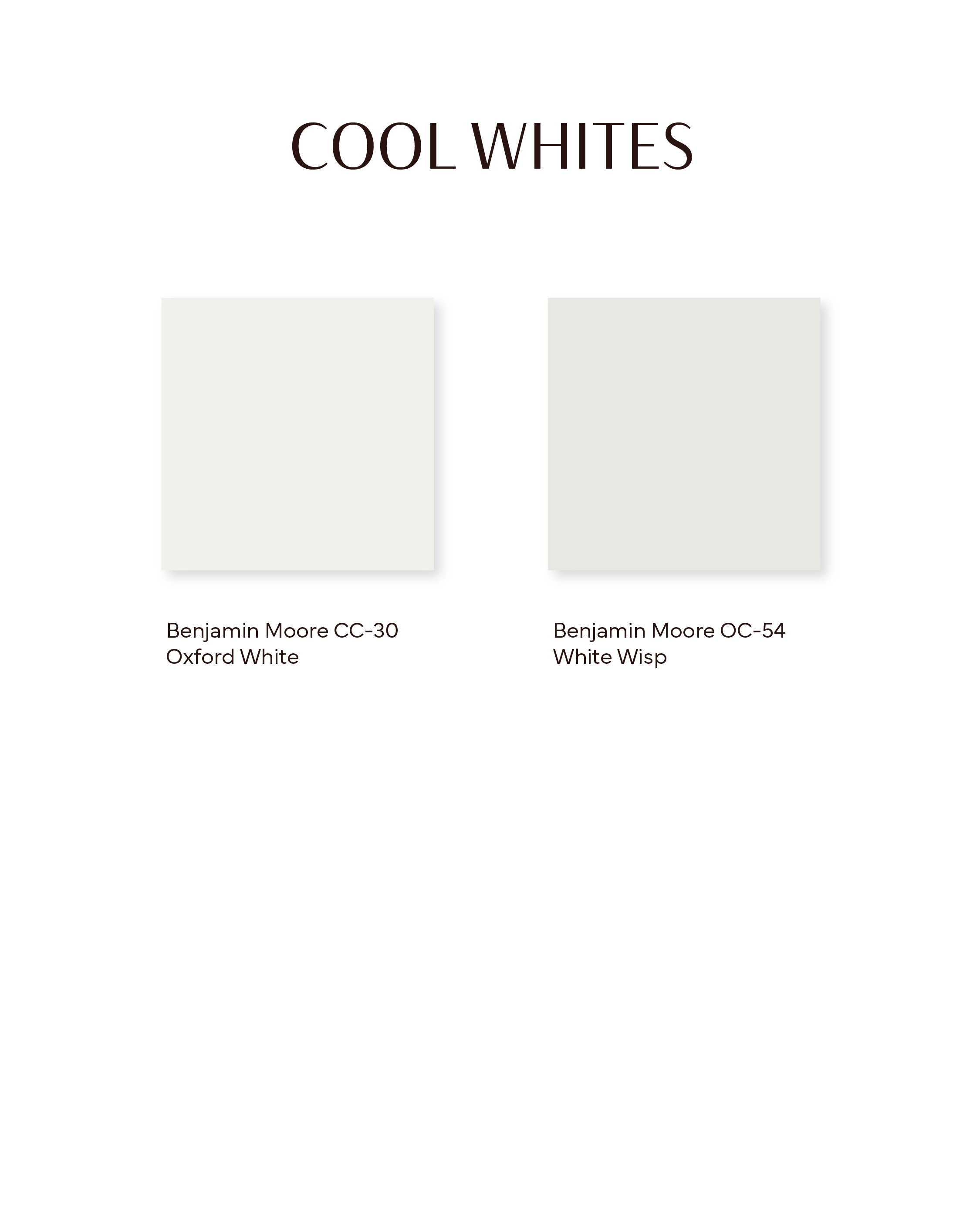
COOL WHITES
Benjamin Moore CC-30 - Oxford White
Neutral, bright, crisp! A slightly cooler white with a soft blue undertone that feels crisp but not sterile.
Benjamin Moore OC-54 - White Wisp
Cooler white, but it remains fairly neutral due to its subtle cloudiness that offsets it from feeling like it has a strong undertone. This one is very neutral, but leans a little towards cool.
MCM Brock Project in Benjamin Moore CC-30 - Oxford White
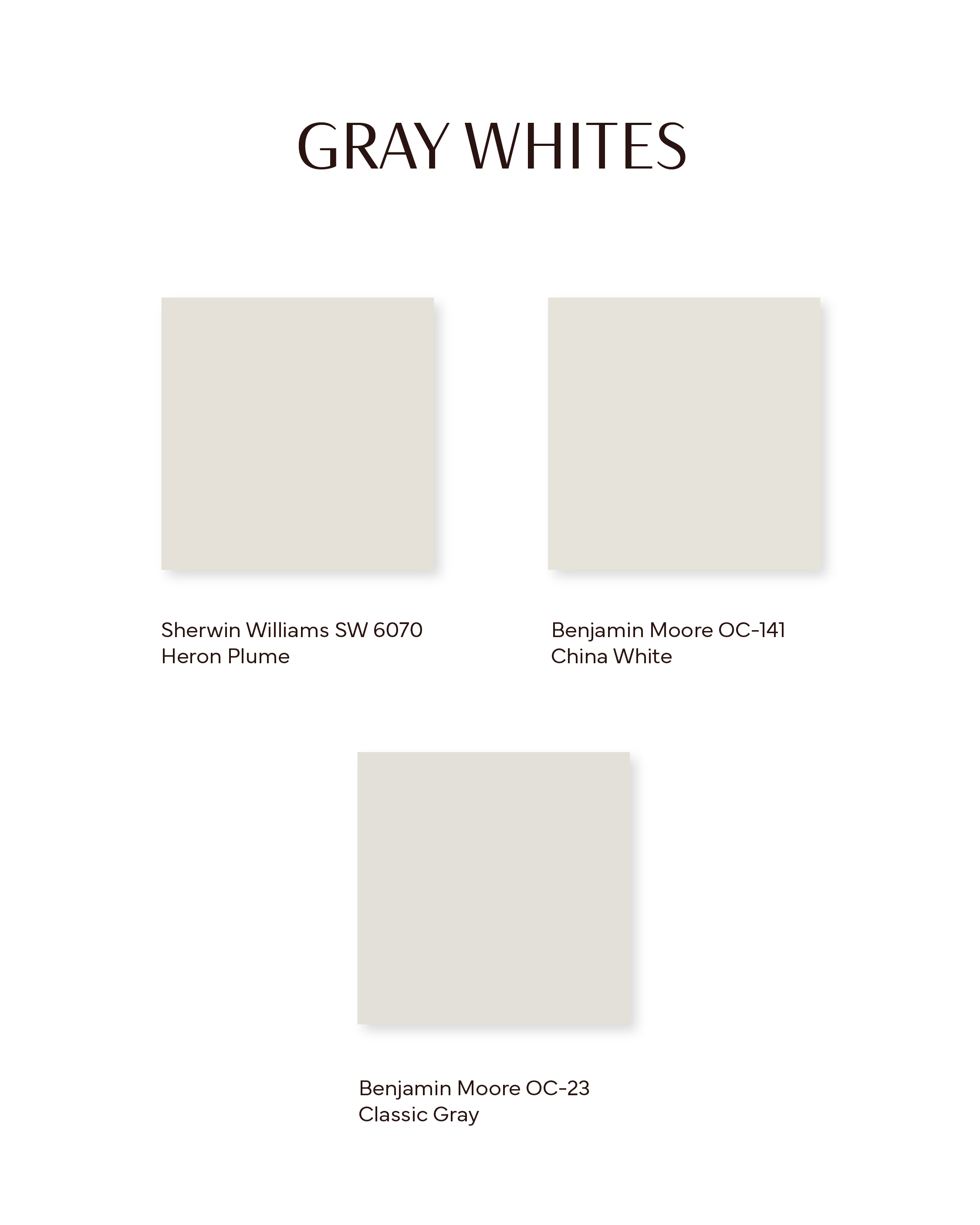
GRAY WHITES
Sherwin Williams SW 6070 - Heron Plume
A soft, balmy off-white with warm grey/beige undertones, that can occasionally lean a touch purple depending on the light. Great for when you don't want just white, but also don't want to commit to a colour.
Benjamin Moore OC-141 - China White
Cooler white that reads quite neutral, which is why it's a good one for cool spaces (so that the white isn't overtaken by cool undertones).
Benjamin Moore OC-23 - Classic Gray
Calm, warm, and inviting — a perfect neutral, with warm grey undertones.

Victoria Crescent Project cabinets in Sherwin Williams SW 6070 - Heron Plume
Warmer palettes are definitely having a moment right now, with cool tones being used more sparingly—often just as accents. When we do use cooler colours in a space, we almost always balance them with a warm or neutral white to keep the space from feeling too cold or clinical. Cool whites tend to reveal their blue undertones quickly, making them trickier to work with, whereas warm whites shift more gradually and subtly—making it easier to find that perfect, balanced tone. For that reason, we typically reach for warm or true neutral whites over cool ones, especially in spaces where we want to maintain a cozy, welcoming feel.
Still unsure?
If you’re still feeling lost with your selections, book a Virtual Design Intensive Consults with us to avoid the stress and gain clarity before you commit. We’ll help you consider light direction, finishes, and undertones—plus give you our curated go-to’s so you don’t get overwhelmed by the wall of whites at the paint store!
BOOK YOUR DESIGN CONSULT TODAY and let us help you find your perfect white!