A LOOK BEHIND OUR REBRAND
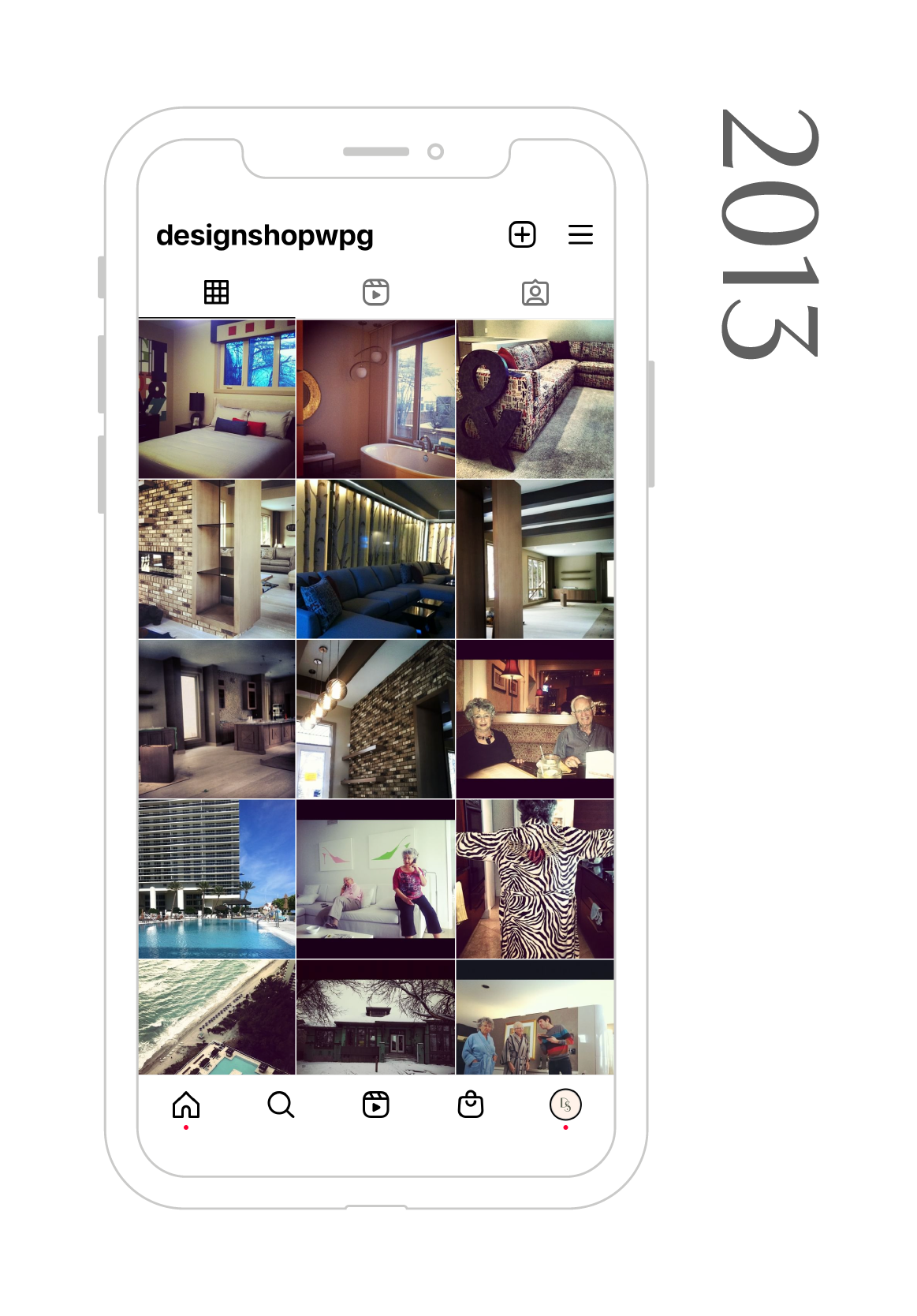
Design Shop was founded almost 10 years ago and over the past decade, we’ve seen countless changes in our industry and the design world in general.
We’ve watched as social media took centre stage as a place to share our portfolio and build community. We’ve lived through a pandemic. We’ve worked with countless clients to design homes and businesses that provide continuity, beauty, and efficiency to every day life.
One of our founding principles was a commitment to flexibility and change and it’s become ever more important as the scope of our projects has widened and we’ve expanded our studio.
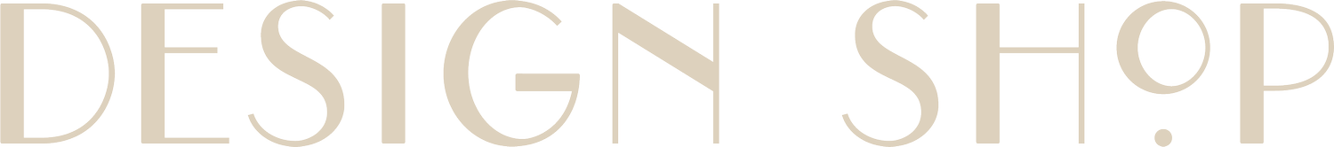
Our original logo, circa 2013.
When we (Amanda + Debs) first started the business, we built our brand around the idea of a scrappy, women-owned business dedicated to jargon-free, client-focused projects. You can see this in the first ever iteration of our logo! It’s fun, playful, and quirky. All things we wanted represented in our visual identity.
In the very beginning we often found our clients asking us for help with visual branding for their businesses so you’ll notice that our tagline included branding. For the first 4-5 years of Design Shop’s existence, this combination of services served us and our clients well.
When we started to expand in 2018, we decided Design Shop needed a new, fresh outlook. We had grown and matured as a business, taking on large scale commercial projects and working with more and more clients. We wanted our logo and branding to represent this shift.
It was then that we hired Nowaday Studio to work with us on a deep dive of the goals, vision, and mission of our brand; along with a refresh of the visuals associated.
We wanted to communicate our growth in the design world and the fact that we were more than just a fun group of quirky women, but a team with years of experience, mentorship, and expertise.
We also needed to communicate that our graphic design days were over and that our team was no longer entirely female. Our cute nick name, the Design Shop Girls, was starting to be a misnomer and we wanted to make sure our branding communicated professionalism and diversity in our team.
Working with Kait from Nowaday along with our internal team, a group of close friends, and trades, we began to establish the next phase of our brand identity.
We set big goals, with a vision for transforming our social media account, website, and visual identity and at the end of 2018 we launched our first rebrand.
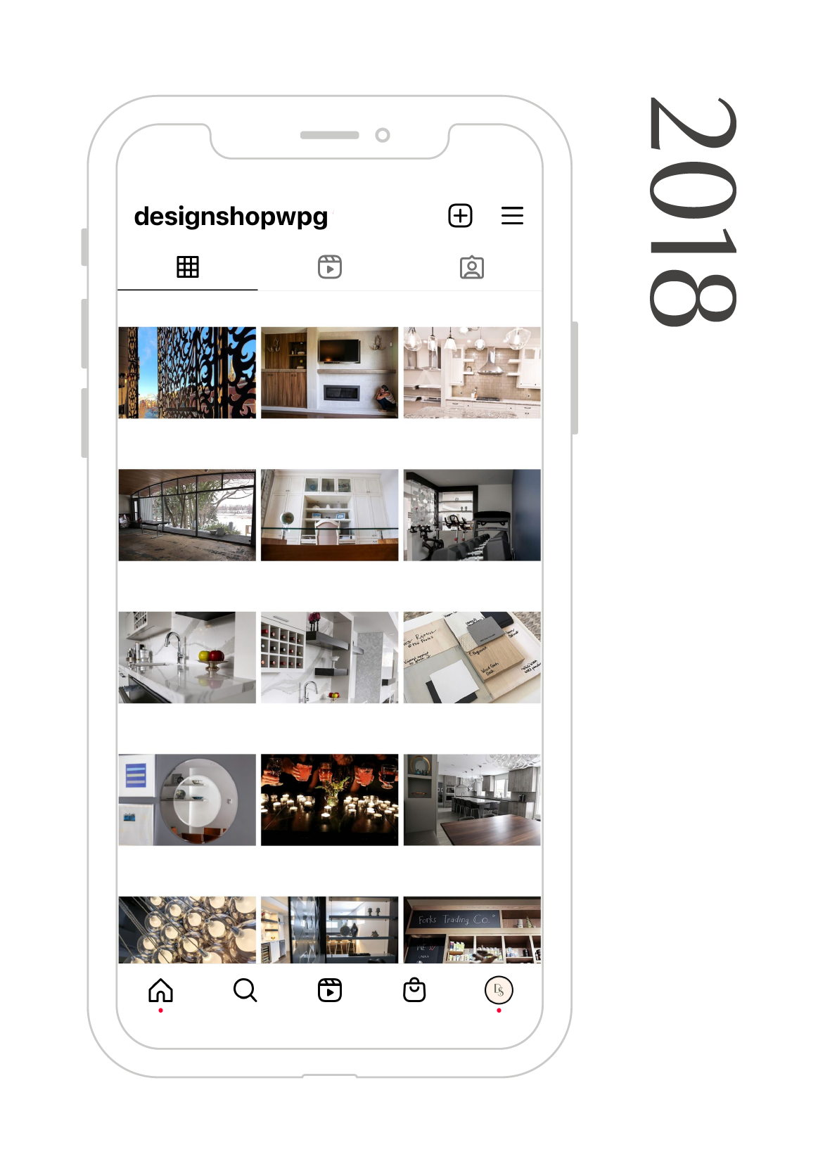
Over the course of the next few years our website and social media presence took centre stage as the place where we connected with our community. We made a concerted effort to create a cohesive and recognizable brand through our marketing AND we upleveled our team and our portfolio.
With the arrival of Covid-19 in 2020 our business (along with so many others) shifted significantly. It was a global pandemic that let people in on our secret recipe for working collaboratively and with flexibility – we had always worked remotely. We created online courses and let people in on our process, while continuing to take on our largest projects to date (Ubisoft Winnipeg, Form Aesthetics to name just a few).
We saw our following on social media grow rapidly during this time – and it felt like the right moment to make another shift.
Many of the goals we had made in 2018 with our first rebrand had been met and exceeded. The misconceptions we had run into with our name and offerings were now a thing of the past.
We felt the time was right for another deep dive into our business goals and visual identity.
This time, we took our now well-known logo and refined it. Once again we worked with Nowaday Studio to approach this rebrand project with a focus on brand voice and authority, rather than a new logo. (Although refinements and care went into updating and customizing our current logo.)
We wanted to bolster our already strong visual identity with new brand goals and a clear voice that expressed the growth and experience we’ve had as a team. While the visuals of our new website and our updated logo are a huge part of our brand, who we are is defined by more than these things.
It’s the way we express ourselves to our community. Our commitment to white-glove interior design services for every single one of our clients. And the growth of our voice as a key player in the Canadian interior design scene.

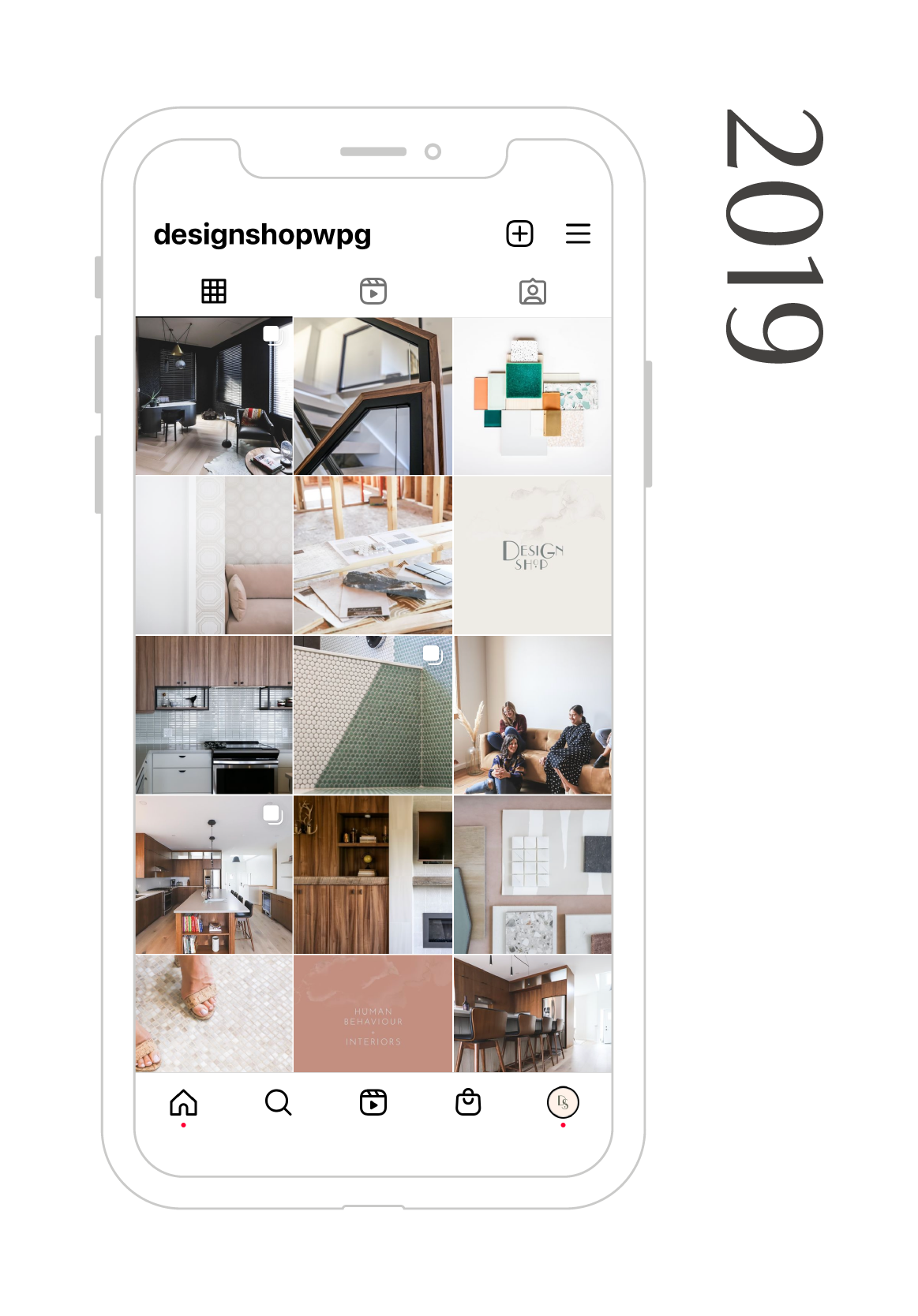
Our logo circa 2019.
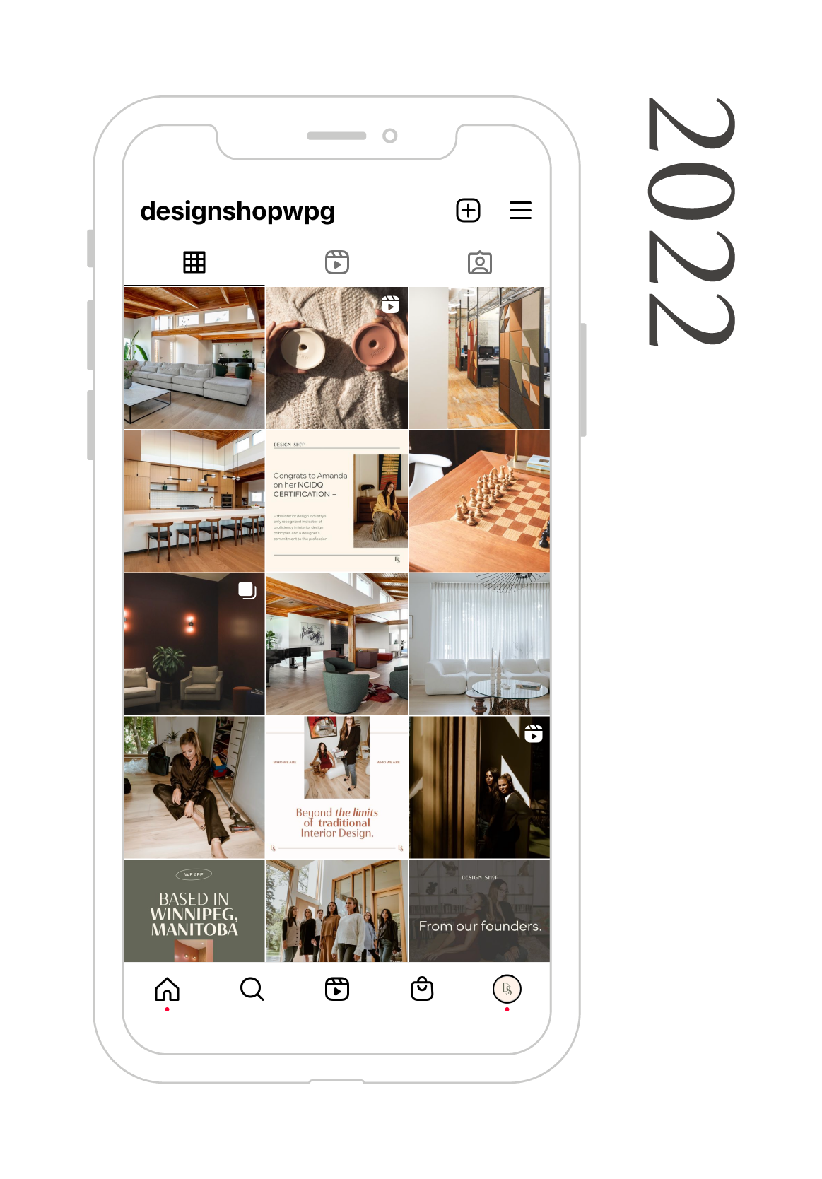
Our logo circa 2022.
We’re proud of what we’ve accomplished. We’ve refined, redefined, and re-envisioned our brand. From top to bottom, we’ve given our brand a refresh to reflect the changes and progress we’ve experienced over the past 10 years.
We’re thrilled with the results of many months of hard work and we’re so happy and thankful that you’re here, reading about it and cheering us on. We couldn’t do it without you.